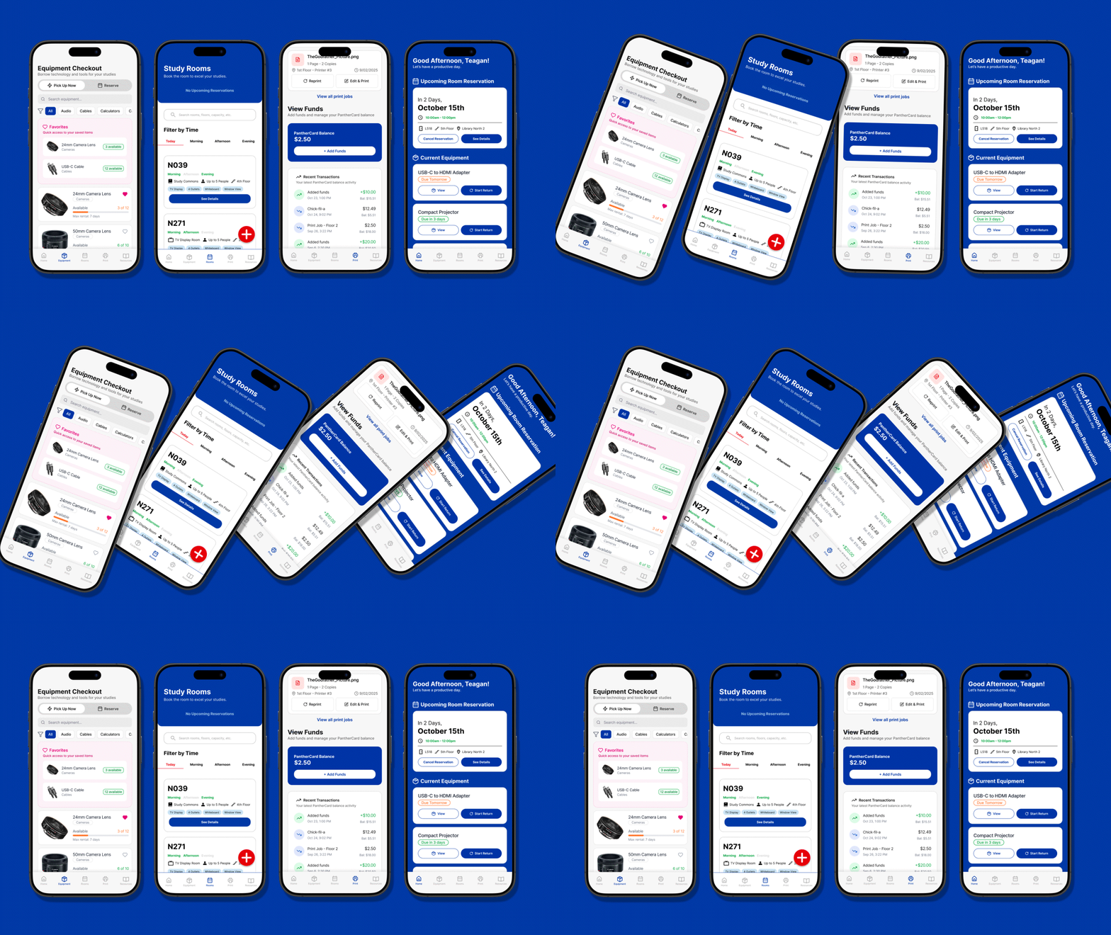
GSU Library App Case Study
An app for the Georgia State University Library that reimagines how students discover, reserve, and access campus study spaces and technology through a streamlined, mobile-first experience.
Timeline
October 2025
Collaborators
Michelle Altine
Project Type
Experience Design, UI/UX Design, App Design
Role
Lead Designer, Lead Researcher

OVERVIEW
A library in your pocket
This project reimagines how students engage with the Georgia State University Library’s Spaces & Technology resources through a mobile app built for everyday use. It focuses on making it simple to reserve study rooms, borrow equipment, and find what’s needed without the usual frustration. At its core, the design creates a smoother, more supportive experience that fits seamlessly into campus life.
Students at Georgia State University often struggle with the library’s clunky online system, spread across multiple sites that isn’t mobile-friendly. I’ve felt that frustration myself! I was jumping between tabs just to reserve a room or check out equipment. This project simplifies it all into one app where students can easily find, reserve, and manage the library’s spaces and technology.
Challenge
My approach followed the Double Diamond process—Discover, Define, Develop, Deliver—with the end user at the center. Each stage focused on understanding, refining, and creating with purpose, ensuring the final outcome was thoughtful, user-driven, and grounded in clear design thinking.
Approach
DISCOVER
The problem
Students at Georgia State University rely on the library’s online system to reserve study rooms, borrow technology, and access on-campus resources.
However, these tools are spread across multiple websites that aren’t optimized for mobile use. As a result, completing simple tasks takes too many steps and often leads to confusion or frustration.
As a GSU student, I’ve often found the library’s systems confusing and time-consuming to use. This project was a chance to learn from those challenges and explore how the experience could be made easier for others. Throughout the process, I tried to stay aware of my own perspective while listening to and reflecting the needs of other students.
Understanding the problem from the user
With over 52,000 students at Georgia State University, I interviewed 13 juniors and seniors from a wide range of majors to understand how they use the library. From these conversations, I learned that 92% of students use the library’s services regularly, and every participant had used its services at least once during their time at GSU.
To gather insights, I conducted one-on-one interviews and distributed a short Google Form survey to capture broader usage patterns. The qualitative data from interviews and quantitative results from surveys were organized in FigJam, where I mapped student behaviors, pain points, and recurring themes to identify key opportunities for improvement.
Collecting Data
Quantitative data helped me highlight what really matters to users by revealing patterns that guide better design decisions over time. This also helped us be able to measure impact.
Top User Problems (from user interviews)
Top Student Ideas (from user interviews)
Beyond the core issues with printing and room reservations, students expressed frustration with how difficult it is to access vital information and borrow equipment efficiently. The current system isn’t responsive on mobile and offers no clear way to track borrowed or returned items. Many also struggled to find library resources, which are scattered across several disconnected and confusing web pages.
Beyond the Primary Issues
Pain Points
I wanted to identify pain points across the different sections of GSU’s Spaces and Technology resources, since each one serves a unique purpose and needs to be understood from its own perspective.
Some issues came up repeatedly and needed to be addressed. One common frustration was the DUO login, GSU’s two-factor authentication system. This was simplified by allowing users to log in directly through their account within the app.
Another major issue was double-booked rooms—something I recognized from personal experience using the library. In reality, only one person receives the confirmation email, creating the illusion of overlapping bookings. This can be resolved with a clear confirmation screen that instantly shows when a reservation is successfully made.
DEFINE
What is important, and why?
After gathering insights from research and interviews, the next step was to define the core problems students face and translate them into clear design goals. This stage focused on turning observations into actionable direction for the app experience.
“Students at Georgia State University struggle with a fragmented, non–mobile-friendly library system that makes simple tasks frustrating and time-consuming. This redesign unifies those tools into one intuitive app for easier access and navigation.”
With the problem statement as a guide, I began developing user personas and journey maps to better understand the general/average student experience. These tools helped me empathize with different types of users by telling their stories—rooted in real struggles and feedback I’d heard from my peers and friends.
User Personas and User Journey Map
My collaborator, Michelle, played a big role in this process as we brainstormed opportunities and explored what we could learn from my research together.
The journey map was key to understanding and humanizing the interviews and data. It uncovered opportunities that hadn’t been clear before and clarified what users truly need, setting focused goals to guide wireframing and design. From this, two main takeaways emerged: Core Goals and User Needs.
Core Goals and User Needs

DEVELOP
Creating for the user
As Michelle and I entered the development phase, we focused on keeping the user at the center of every decision. We created sitemaps and user flows to define a clear structure, then built low-fidelity wireframes to test layouts and navigation. Through ongoing iteration and usability testing, we refined the design to make it intuitive, efficient, and seamless on mobile.
Sitemap
This layout was subject to change and did evolve through testing, but it served as the original map that guided the rest of the app’s design.
Creating user flows was an essential step in the process. Since navigation was one of the biggest pain points uncovered in our research, mapping it out helped me visualize how the app should function and what features needed to be included. I wanted to make sure that we kept the user engaged without getting lost.
The user flow shown here is a specific flow, focused on getting to the room reservation process.
User flows
Here’s a look at part of the room filtering lo-fi designs. These early sketches helped shape the core layout and flow before moving into detailed visuals. To explore more, you can view the partial set of lo-fi wireframes in Figma, which includes screens for the homepage, room reservations, and additional reference layouts.
Lo-Fi Wireframes
We created several iterations based on usability testing, updating the lo-fi designs as we learned from each round. Moving from lo-fi to hi-fi made a huge difference—it clarified how users actually interacted with the app and brought the design’s usability into focus.
Iterations and Usability Testing
We streamlined the entire process to make key actions happen in as few clicks as possible. The app also needed to be fully responsive, addressing a common issue raised by participants who shared frustration with not only the library website but GSU’s systems as a whole.
Key takeaways
It’s all coming together!
DELIVER
The Deliver phase brings everything together—refining the design through high-fidelity wireframes, interactive prototypes, and usability testing. This stage focuses on validating decisions, polishing visuals, and making sure the final product truly works for users. It also sets the foundation for measuring impact, connecting the design process back to real outcomes and user experience improvements.
To stay true to the Panthers, the app’s visual language follows Georgia State University’s established brand system to maintain consistency across platforms. Colors, typography, and tone were carefully aligned with GSU’s identity, helping the app feel like a natural extension of the university’s ecosystem. This consistency builds trust and makes the experience cohesive and familiar for students.
The app really started to take shape at this stage. Seeing the high-fidelity wireframes come to life with full branding was one of the most exciting parts of the process. These hi-fi designs were key for building prototypes and testing whether participants could easily find specific, prompted information on each page.
High-Fidelity Wireframes


Final Prototypes
The final prototypes built on our hi-fi wireframes by adding in-between screens, pop-ups, and transitions to simulate real interactions. These functional* prototypes allowed us to test with participants and collect meaningful data on usability. The goal was to measure improvements—reducing clicks, time, and frustration—while making sure the experience felt smooth and intuitive from start to finish.
*The main app prototypes aren't fully complete yet, but that’s where the project is headed next. For now, we built out the main user flows—focusing on the core interactions that matter most to students and how they navigate the app day to day.
I’m sharing three of the main prototype flows that really capture how students would use the app day to day. One shows the printing process, another walks through reserving a room, and the last gives a general look at how users move through the main pages. These flows represent the moments that matter most and show how the design makes each task feel smoother and more natural.
Three Main Prototype Flows
General Pages Prototype
Room Reservation Prototype
Printing Process Prototype
IMPACT
From frustration to flow
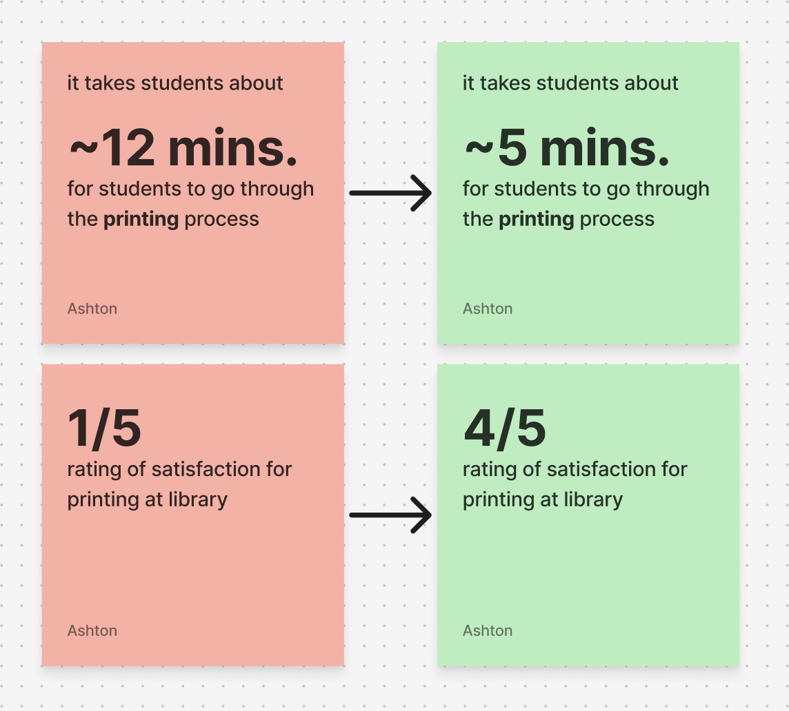
To evaluate the effectiveness of the redesign, we combined usability testing with participant feedback to understand how students interacted with the new app. The results showed noticeable improvements in how easily students could navigate, complete tasks, and access the resources they needed.
Participants described the experience would be “much simpler to use” and “something that could actually saves time between classes.” The feedback confirmed that bringing all core functions—reserving rooms, borrowing equipment, and managing resources—into one cohesive app meaningfully improved the overall student experience.

Fascinating Metrics!

Working on this project was a rewarding experience that deepened my understanding of the entire experience design process. I’m genuinely glad I took it on—it pushed me to think critically about how design can solve real problems and make everyday tasks easier for students like me. Seeing the concept come to life and resonate with others was incredibly fulfilling and reinforced why I love creating meaningful, user-centered design
Personal Impact
EVOLUTION
What are the next steps?
Looking ahead, I plan to continue refining the app by developing more complex, high-fidelity prototypes that capture the full range of interactions and features. Once the final prototypes are complete, I hope to share the project with Georgia State University to encourage consideration for real implementation. I also plan to conduct additional usability testing to gather deeper insights and ensure the design truly meets the needs of a larger range of GSU students.
