
Akuma Case Study
Akuma is my original hot sauce brand—Japanese-inspired, with authentic flavors and bold, street-style visuals designed to stand out against global staples.
Timeline
July 2025 - August 2025
Collaborators
N/A
Project Type
Brand Identity, Product Design
Role
Brand Designer
OVERVIEW
Akuma is a fierce, Japanese-inspired hot sauce that fuses authentic heat with the raw edge of American street culture. Its look is unapologetic—razor-sharp kanji, punchy colors, and a rebellious streak—built to stand out in both flavor and style.
Forged in flames…flames being my laptop
The Asian hot sauce scene is ruled by staples like Sriracha and gochujang, while Japanese flavors barely make a ripple on the global stage. Despite Japan’s deep culinary heritage, no brand has truly fused authentic taste with bold, attention-grabbing design to compete in a style-driven market. Most stick to traditional packaging, overlooking younger, trend-savvy buyers craving something fresh and exciting. Akuma is here to flip that script—and claim its place at the top.
Challenge
RESEARCH & PLANNING
I dove into the top Asian hot sauce brands, studying their packaging, visual style, and the cultural stories they tell. The goal was to spot the design and strategy patterns that draw customers in—and the gaps where a Japanese-inspired brand could stand out. The research revealed a clear opportunity: pair authentic Japanese heritage with a bold, modern look, and you’ve got a brand ready to dominate both the shelf and the culture.
Before the burn
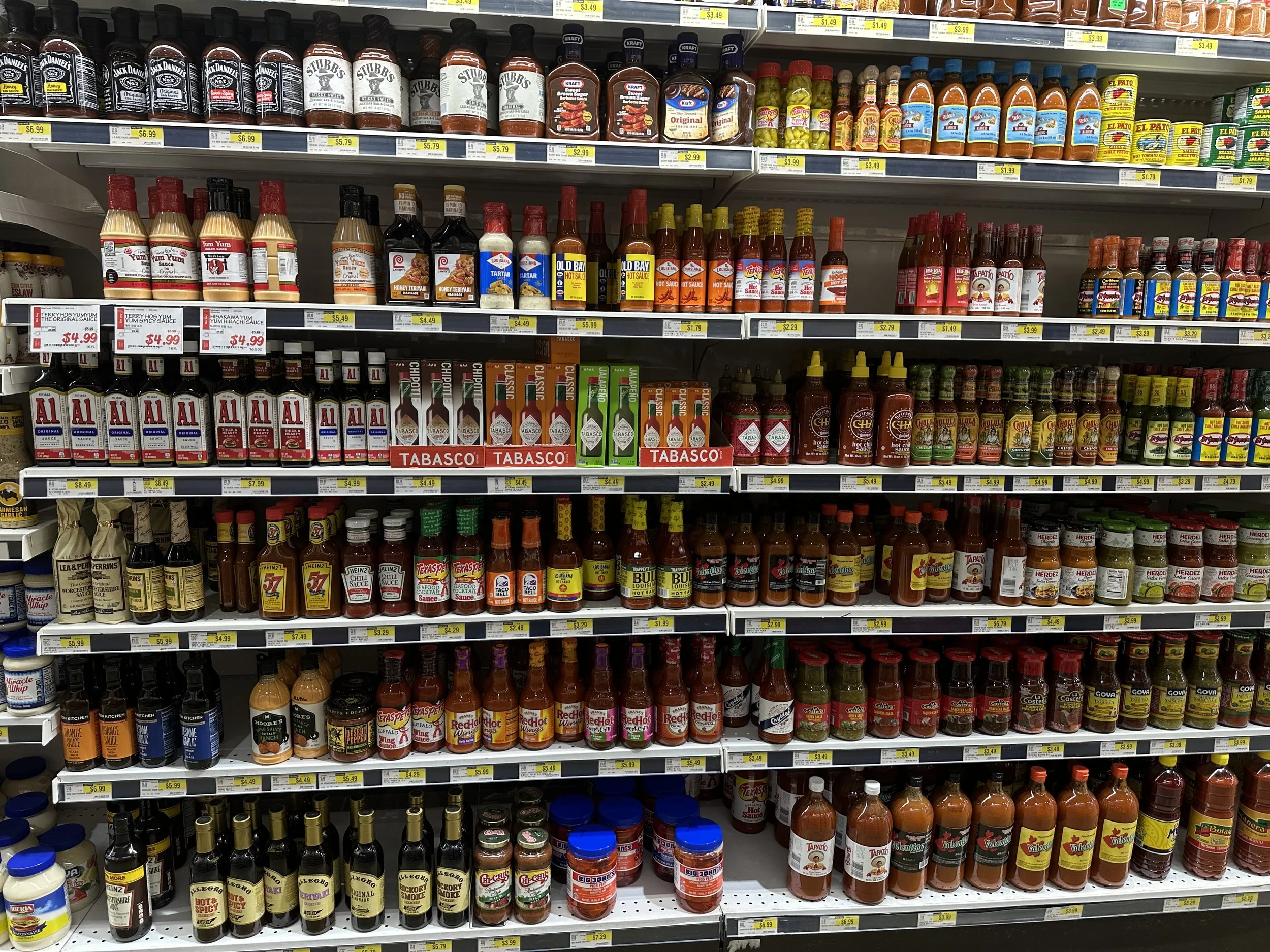
The hot sauce aisle at H-Mart—a well-known Asian market—gave me a close look at how brands compete for attention. Seeing the variety of labels and packaging in one space helped me think about where Akuma could stand out and claim its own spot on the shelf.
I explored the cultural roots of the word “Akuma” in Japanese folklore—an evil spirit or demon embodying fear, power, and intensity. That meaning fueled the brand’s personality, making Akuma about more than just spice. In parallel, I looked at how American culture ties extreme heat to the devil, hellfire, and a playful sense of danger. These shared symbols of intensity bridge the two worlds, giving Akuma an authentic Japanese soul with a universally understood “this is seriously hot” vibe.
Folklore Research
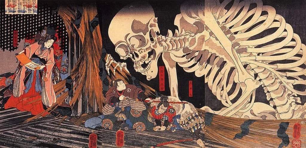
Akuma isn’t one single monster—it’s a whole category of evil spirits. This guy happens to be a yokai, but it still could be considered an Akuma.
My typographic research centered on Japanese scripts, with a special focus on kanji. I explored both katakana and kanji, ultimately choosing kanji for its cultural weight and striking visual presence. I studied how each character is built—its components, stroke weight, proportions, and spacing—to reimagine the “Akuma” kanji. The result keeps its clarity and traditional form, while introducing a bold, modern edge that captures the spirit of the brand.
Typographic Understanding

I pulled together a mood board to explore just how far I could push kanji in unique and experimental ways. It became the guide for finding the style that truly captured what Akuma is all about.

I started by sketching both kanji and katakana, testing how each could bring Akuma’s identity to life. Playing with strokes, shapes, and proportions made it clear—kanji carried the bold, authentic personality the brand needed.
To shape Akuma’s visual language, I pulled references from everywhere—Japanese folklore, typography, streetwear, graffiti, and even the loud designs of hot sauce packaging. I distilled these into a mood board that revealed recurring textures, colors, and energy. This process helped turn loose ideas into clear visual cues, creating a direction that stayed rooted in Japanese culture while feeling fresh, bold, and street-ready.
Brand Moodboard
SKETCHING & IDEATING
I started the sketching phase by exploring a wide range of directions—experimenting with logo marks, symbols, and supporting visuals to see how Akuma could take shape. I tested different balances of boldness and restraint, aiming for a mark that carried heat without feeling aggressive. As the ideas developed, I refined toward a logo that was simple, distinctive, and paired with visuals influenced by modern street style. This stage built the foundation for a brand that feels like a calm fire—controlled, steady, and undeniably powerful.
Sparking ideas and fanning the flames

Early Logo Sketches
Sketching logo marks sparked ideas, starting with a quick “word-vomit.” Some concepts didn’t make the final logo but inspired supporting graphics and brand assets, showing how set-aside sketches still fuel the identity.
I realized that a typographic logo would serve Akuma best. I experimented with two non-type logos, but moved away from them so the rest of the brand could carry the supporting visuals while the logo stayed as a strong grounding point. From there, I explored different typefaces that could capture Akuma’s bold and modern character, knowing from the start that the logo needed to be in all caps to push its edge and intensity even further.
Digital Logomarks

After exploring different options, I landed on BD Orange VF—it was the perfect fit. It had the strength, edge, and flexibility the brand needed, and locking it in all caps pushed the boldness even further.
In the final stage of development, I narrowed my exploration to two main directions. The first leaned into balance and subtle symbolism, keeping the wordmark symmetrical and clean while reshaping the “A’s” into faint horn-like forms. These horns were understated, but carried just enough weight to echo Akuma’s devilish character without compromising clarity.
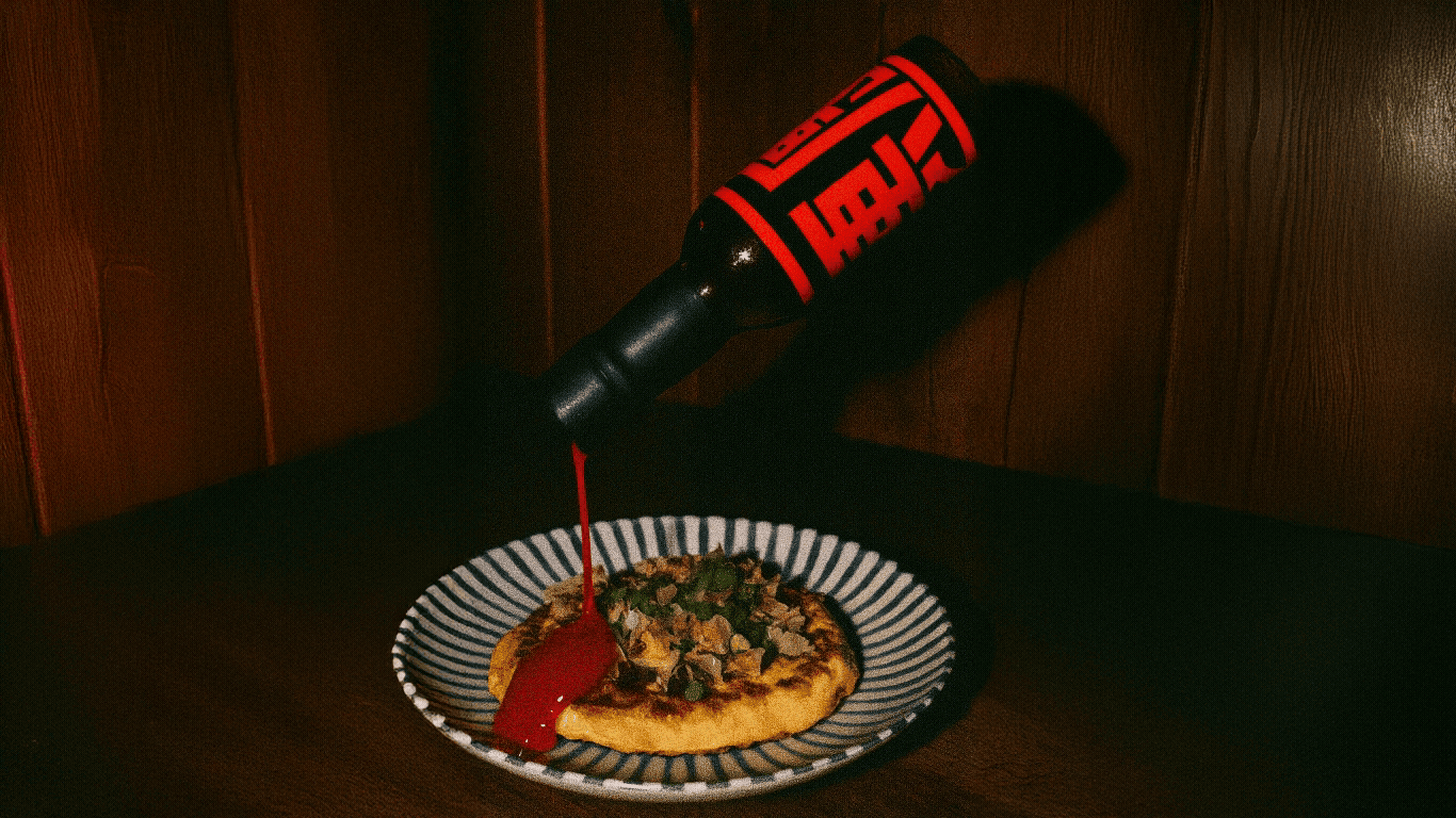
The second direction built on that foundation but pushed the concept further by integrating the silhouette of a hot sauce bottle into the mark. This variation grounded the identity directly in the product, making the logo both recognizable and tightly connected to the physical experience of the sauce.

The subtle devil horns in the “A’s” got a nod for being clever, but feedback reminded me that the logo still needed a stronger hook to stand out in such a competitive space.

The bottle silhouette version quickly became the favorite—reviewers felt it made the logo more memorable and tied Akuma directly to the product, giving it stronger recognition on the shelf.
DESIGNING
Igniting the vision
With the foundation set through research and early exploration, the design stage focused on bringing Akuma’s concept to life as a complete visual system. This section shows the progression—from logo refinements to identity assets and final deliverables—illustrating how rough sketches and ideas evolved into a cohesive brand. The emphasis was on execution: how typography, color, supporting graphics, and packaging all work together to give Akuma its sharp, distinctive presence.
Final Logo Variations
To make sure Akuma’s identity could flex across different uses, I created a system of logo variations and marks in multiple sizes. Keeping them minimal was key—so each mark stayed sharp and recognizable whether on a tiny label, a digital screen, or a large-format piece. This adaptability gave the brand versatility while still holding onto its bold, consistent character.


The red circle became a simple but powerful way to anchor Akuma. It nods to the Japanese flag while staying minimal, giving the brand a mark that feels rooted, versatile, and instantly recognizable.
Red and black do the heavy lifting in Akuma’s identity—red bringing heat and intensity, black adding weight and balance. Paired with carefully chosen typefaces, the palette reinforces a bold yet minimal character. Together, they tap into contemporary design trends, giving Akuma a look that’s sharp, eye-catching, and built to connect with a younger, style-conscious audience.
Color Palette & Typography

VISUALIZING
A radiant blaze
The final stage compiled a full library of visuals and deliverables, including the logo system, packaging, mockups, merchandise, and digital assets. This complete set extends Akuma’s identity beyond the bottle, ensuring consistent, impactful presence in physical and digital spaces with genuine emotion.


